Creating Responsive Websites for Any Device
$49
ENROLL NOWCourse Overview
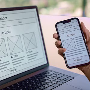
In this course your web design skills go from good to great. This course is all about responsive design—creating layouts that look just as killer on a smartphone as they do on a desktop. You’ll dive into Flexbox and Grid, the CSS superheroes that make flexible, adaptive designs possible. And with media queries, you’ll fine-tune every pixel, making sure your sites look sharp no matter the screen size. But it’s not just about the code. This course gives you hands-on experience designing for real-world audiences. You’ll test, optimize, and learn best practices for making accessible, visually appealing layouts that stand out. By the end, you won’t just know how to code responsive sites—you’ll know how to think like a pro designer, giving users the best experience on any device.
Course FAQs
What are the prerequisites for 'Creating Responsive Websites for Any Device'?
Prerequisites for this continuing education class are set by University of Washington. Most professional development online classes benefit from some prior knowledge. Please check the provider's page for specific requirements.
Will I receive a certificate for this CE class?
Yes, upon successful completion, University of Washington typically offers a shareable certificate to showcase your new skills and fulfill your continuing education requirements.
How long does this online course take to complete?
Completion times for online continuing education courses vary. The provider's website will have the most accurate estimate of the time commitment needed.

